What if Apple used Comic Sans?
Have you ever asked yourself what different brands would look like if instead of their trademark minialist (read: Helvetica) fonts, they used the ever-corny, cult-classic, Comic Sans? No? Just me then?
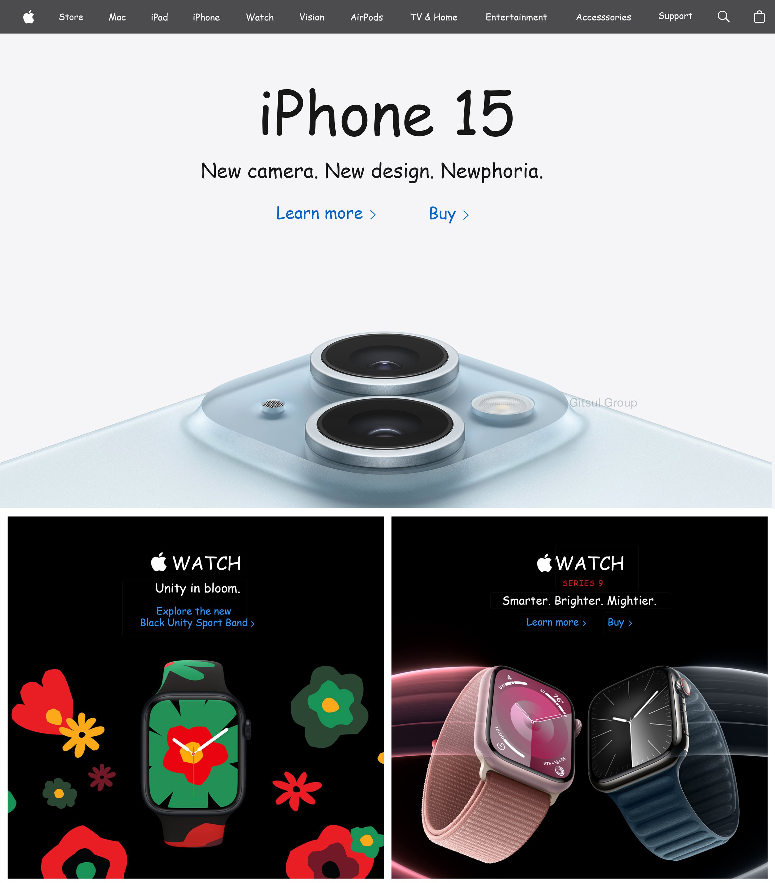
Here’s a look at what Apple’s Homepage would look like if their signature “SF Pro” font were Comic Sans instead.

Imagine viewing the latest iPhone’s webpage in Comic Sans. Change anything for you?
This font exploration was inspired by Tracy Marshall’s Design Challenge on Threads.