The Coolest New Tool For AI-Generated Color Palettes
An awesome new tool creates accessible color palettes for your next design using AI.
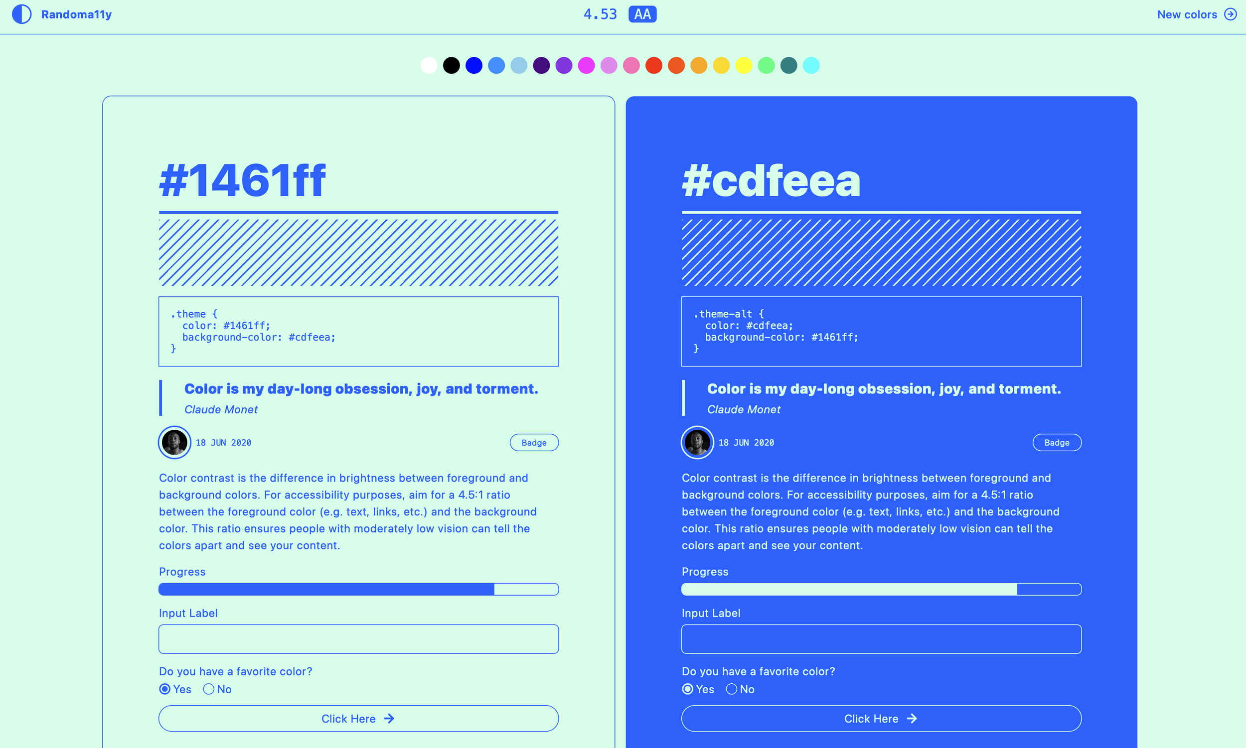
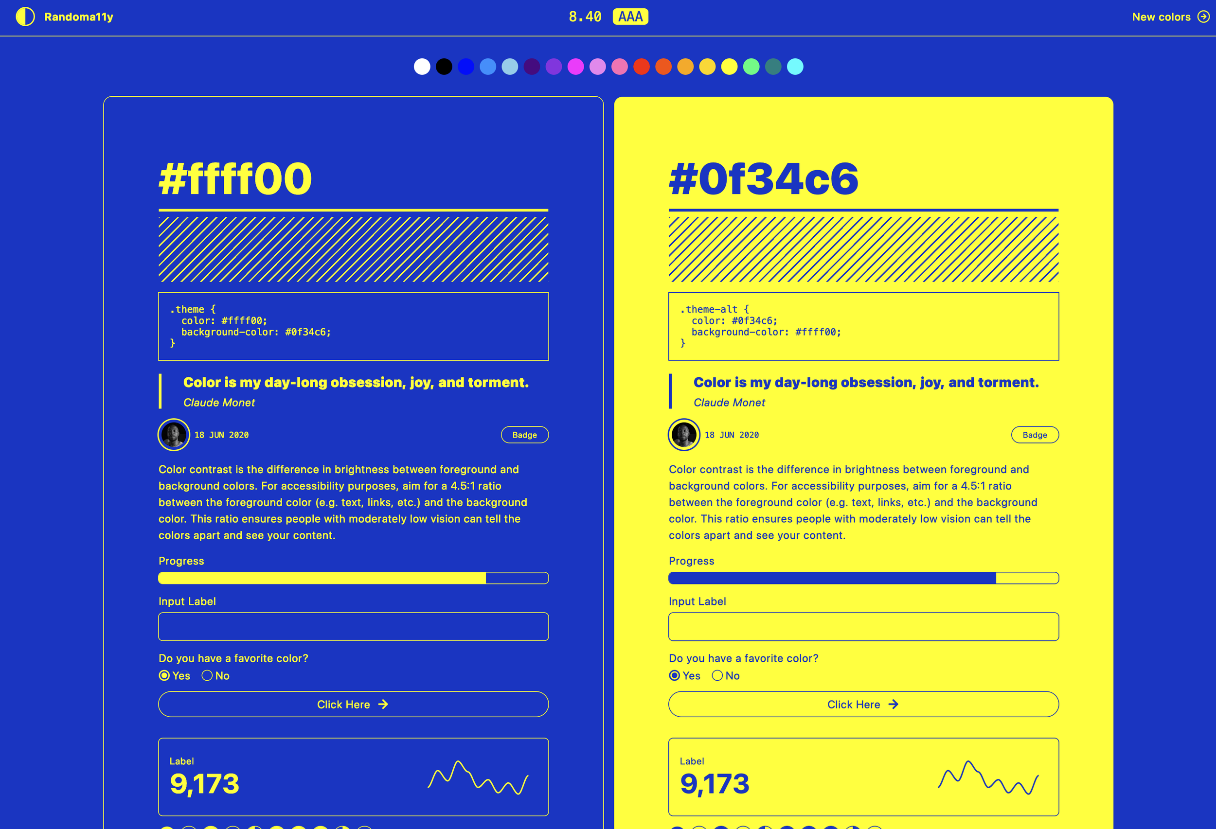
It’s called Randoma11y and it’s built in Components AI. Click on a color at the top of screen, and it will automatically and instantly generate an accessibility- compliant color palette, complete with visual components like boxes, buttons, graphs, and gradients.
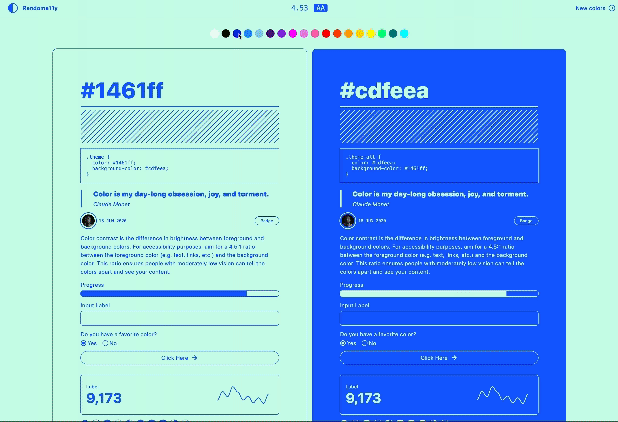
Color contrast is a key aspect of accessible design for UX, graphic design, and web design. Contrast is defined as the difference in brightness between foreground and background colors. Typically, you want to aim for a 4.5:1 ratio between the foreground color (e.g. text, links, etc.) and the background color, which will ensure that people with moderately low vision can tell the colors apart and actually see your content.

Interested in creating accessible color palettes for your next design? Get in touch with us to get a quote for your project!
Check out more about color usage in design on our blog.
Thanks to Felix Lee for sharing this!